A good presentation combines content with visuals that enhance and support it. It’s important that a presentation look professional because it will give the audience an impression of the speaker and his business.
The most impressive charts, photos and graphics help create a link in the audience’s mind between an idea or fact and its visual representation.
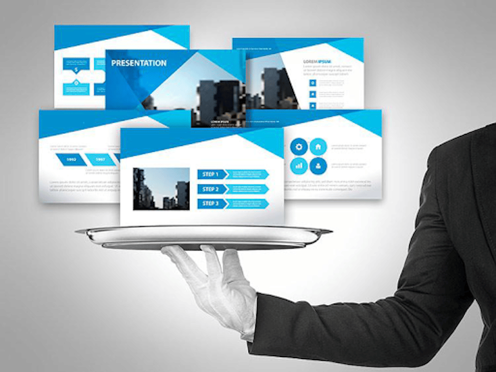
Visuals
Incorporate visuals to reinforce your points, keep your audience’s attention and enhance their understanding. Research, brain scans and eye movement tracking shows that people retain 50% more content when it’s presented visually versus orally.
The visuals you choose should be consistent with the theme and message of your presentation. Avoid using too many images – they can overwhelm the audience. If you are using charts and graphs, make sure they include clear labels and high-contrast colors.
The human brain processes images 3x faster than text. Don’t fill every square inch of your slides with text – white space is relaxing and audience members will appreciate having to not squint. Design your slides for the back row and keep the font size large enough to be read from a distance. Use an image with a person or an arrow to help direct your audience’s gaze and draw their attention.
Text
The quality of the text in your presentations is critical to their effectiveness. Use clear and concise language. Avoid jargon, and explain terms as needed.
Text should be large enough to read from the back of the room, and be set in a font that contrasts well with the background. It is important to include sufficient white space in your slides to prevent them from being cluttered. Avoid using all-cap letters, as they are hard to read and can distract from the presentation’s message.
It is often best to use a sans-serif or serif font for your text, although some presentation design find it effective to mix font styles and sizes to emphasize different elements of a slide. Text alignment, such as justified, can create a clean look, but may be difficult to read if not used correctly due to uneven word spacing.
Layout
The overall layout of the presentation is determined by the type and amount of information you are presenting. The information should be presented in a way that makes sense to your audience. It is recommended that you use consistent contrasting colors for text and background as well as a similar font style throughout your presentation.
A dark background with light text tends to wash out in rooms that have a lot of ambient lighting, while a white background with dark or black text is more legible. Generally, font styles should be kept simple to improve readability for the audience.
For example, if you are presenting financial data you can have the numbers rise or fall on the screen in correlation with the information being discussed to keep the audience engaged. This can be a very effective way of illustrating your point. You can also change the order of slides in the Slide Sorter view, allowing you to rework the logical flow of your presentation.
Animations
When used sparingly, animations can enhance your presentation by giving it structure and visual interest. However, too many can quickly become distracting and confuse the audience. The most common animation is the fade-in, which gradually brings in slide content so that it doesn’t jump ahead of the presenter’s spoken words.
Another popular animation is the zoom, which allows you to draw the audience’s attention to a particular area on a slide.
You can also animate the static visual elements on a slide, such as shapes, icons, and photos. Effects can include blurring, changing the color filter, sliding across the slide, growing in size, or even a typewriter-style action. A common mistake is to overuse the animations; the audience needs to focus on you, not what’s going on on the screen. For this reason, less is usually more when it comes to PowerPoint effects.
Transitions
Text and visual transitions are two easy-yet-effective ways to breathe new life into your presentations. They can help keep audiences engaged, and can also enhance the overall message of your presentation. However, it’s important to use these elements sparingly and strategically. Otherwise, they can distract from your content and make the audience feel disoriented or overwhelmed.
Use soft effects such as fade or wipe to ease the audience from one slide to the next. Avoid too much flashy animations, as they can overwhelm the audience and take away from your content. Instead, try to find a transition that fits your slides’ design and theme and aligns with the message you want to convey.
Another useful type of transition is morph. This feature allows you to animate objects on different slides by changing their position, size, and shape. It can be especially helpful when you have a slide with multiple graphs or charts.
Sound
When used properly, sound effects can enhance the visuals in a presentation, adding to its overall impact. They can also increase the audience’s retention rate and build excitement and anticipation. However, they must be used sparingly as too much noise can distract the audience from the message of the presentation.
The use of sound effects is particularly effective when a presenter is making a major announcement, unveiling a surprise, or introducing a guest. It can also be a great way to congratulate someone on an accomplishment or win. A classic orchestra ta-da or trumpet alert sound effect can be used to announce an important milestone or success.
A presentation designer is a skilled professional who is expert at creating effective presentations for business or personal use. A good presentation designer will have a strong understanding of design principles and an eye for detail. They will also have extensive knowledge of the tools that are available to create high-quality, dynamic presentations.