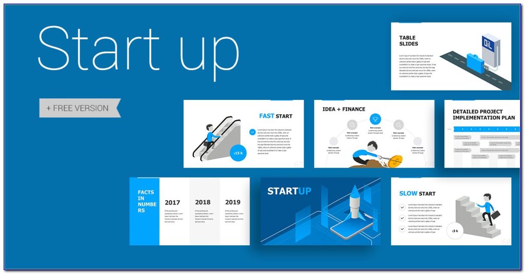
presentation design slides can enhance any presentation. However, they should not be the focus of a presentation or distract from your main message.
Slides were designed to be a convenient way to display graphical information that supports and supplements a speaker’s presentation. Avoid gimmicks such as text fly-ins that distract the audience and slow down the computer.
Visuals
Adding visuals to your presentations can enrich arguments, explain ideas, and make them easier to grasp. However, too many visuals can confuse the audience and distract them.
The key is to cherry-pick images, graphics and charts that look good and align with your message’s vibe. Overusing elements such as flashing text or colors is a sure way to lose the audience’s attention. Also, crowded slides are hard to read for the back row of your audience, so try and keep things as simple as possible.
Text
The text in a presentation should be well-structured and easy to read. It should also be designed to complement the visual elements on the slide and create a visually appealing presentation. Conscious text alignment can also support the visual hierarchy of the content and highlight key information on the slide.
It is recommended to use ‘hooks’ in the presentations, as they help the presenter get and keep the audience’s attention. It is also important to remove any jargon from the presentation and use simple language that will be understood by the audience. This will make the slides easier to understand after the presentation.
Layout
Choosing the right layout is a great way to keep your presentation cohesive and visually appealing. All versions of PowerPoint support templates, which help organize content and make it easier for your audience to understand your message.
Templates are sets of slides that contain placeholders — areas where you can insert your own content, such as pictures, charts, and text. Some templates also include pre-designed layouts that you can use to arrange your own content.
To keep your presentations simple and easy to read, make sure you use high contrast colors and font sizes. Also, avoid using too many images that are difficult to read from a distance and limit the number of animations you use.
Colors
Colors have a powerful impact on how your visual information is received by your audience. They can communicate an emotional message, set the mood and impose structure.
Reds evoke passion and enthusiasm, while blues convey trust and calmness. Pinks can create a feminine and youthful look, perfect for presentations about pop culture or female-oriented business products.
The colors you use in your presentation should contrast well with the background color to make them visible to your audience. The simplest way to ensure that your slides are readable is to use a dark text against a light background, and vice versa. This will ensure that your presentation is readable in any lighting conditions or monitors your audience may be using.
Fonts
When deciding on fonts for your presentation, be sure to choose ones that are 100% legible to your audience. The last thing you want is for your audience in the back to have to squint or strain their eyes to read your slides.
Choose a bold font for your headers that will capture the attention of your audience at a glance. For body text, consider using a sans serif font that’s narrower than Helvetica or Arial.
Some examples of good fonts for presentations include Visby CF, Tahoma, Caridora, RNS Sanz, Vidaloka, and Addington. These fonts are lightweight and modern and offer enough contrast to be easily readable on screens and projectors.
Images
Whether it’s a TED talk, explainer video or the company quarterly meeting, presentations that include images engage and hold audiences’ attention. Images also convey additional cues, and can add a sense of depth to your presentation.
When using images, it’s important to understand copyright law. Even if an image is in the public domain, you may need to clear permission for more elaborative uses.
Luckily, there are resources available to help you find high-quality images for your presentation. Freepik has a vast library of photos, and Kaboompics provides complementary color palettes for each photo. They also offer a variety of effects for adjusting images, such as brightness and contrast.


